Uncovering survey insights
What was wrong
Survey datasets have a unique complexity due to the variety of question types, and variable response-based journeys. The datasets are typically large, wide (i.e. lots of colums), and difficult to decipher.
What we did
We developed a data transformation and modelling process using Python, taking that one cumbersome table and turning it into an optimised set of data tables that tools like Power BI and Tableau love.
Why it mattered
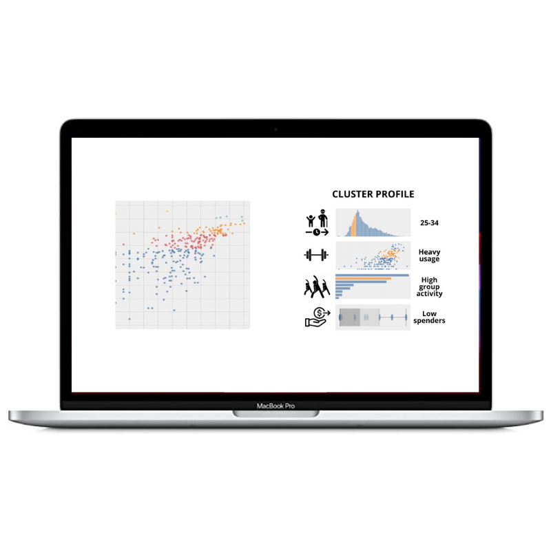
The flexibility of the transformed data means a multitude of visuals, demographic cuts, and time series views are a click away. Play with the sample built in Power BI below.
Amazing!

The summary page highlights key questions, answers and trends. These are cherry picked for quick insights and show aggregated or top answers using colour formatting.
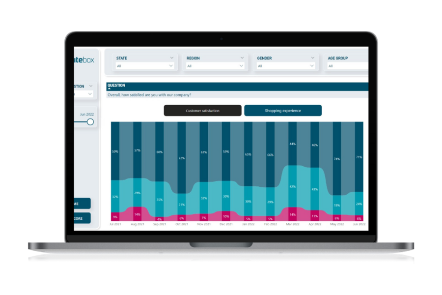
The detail page breaks down every question. There are many different ways to visualise this data but after extensive end user testing, our firm favourite is the ribbon chart (right), which represents the trend and changes on responses to each question.
The example here shows a negative swing in customer sentiment in March and April 2022 - probably due to a client price change.

See more of our customer success stories